These types of businesses usually use their website to get promoted, to acquire a target audience, to convert leads, and to sell. If it fails to make a statement, its future in the online realm is under fire.
So what do startups need to be attentive to when designing a new website? What are the elements that make the deal? And most importantly where do you start building your brand presence?
First things first, even though just a startup, your website must be well created and designed as it will be your small company’s business card. You want to make an impression on your potential customers and partners. Therefore, the website must perform well, must have a special allure that will attract and retain customers and must answer to their answers.
Here are 6 web design trends for startups that will push your business to new levels.
Tip # 1. Responsive website
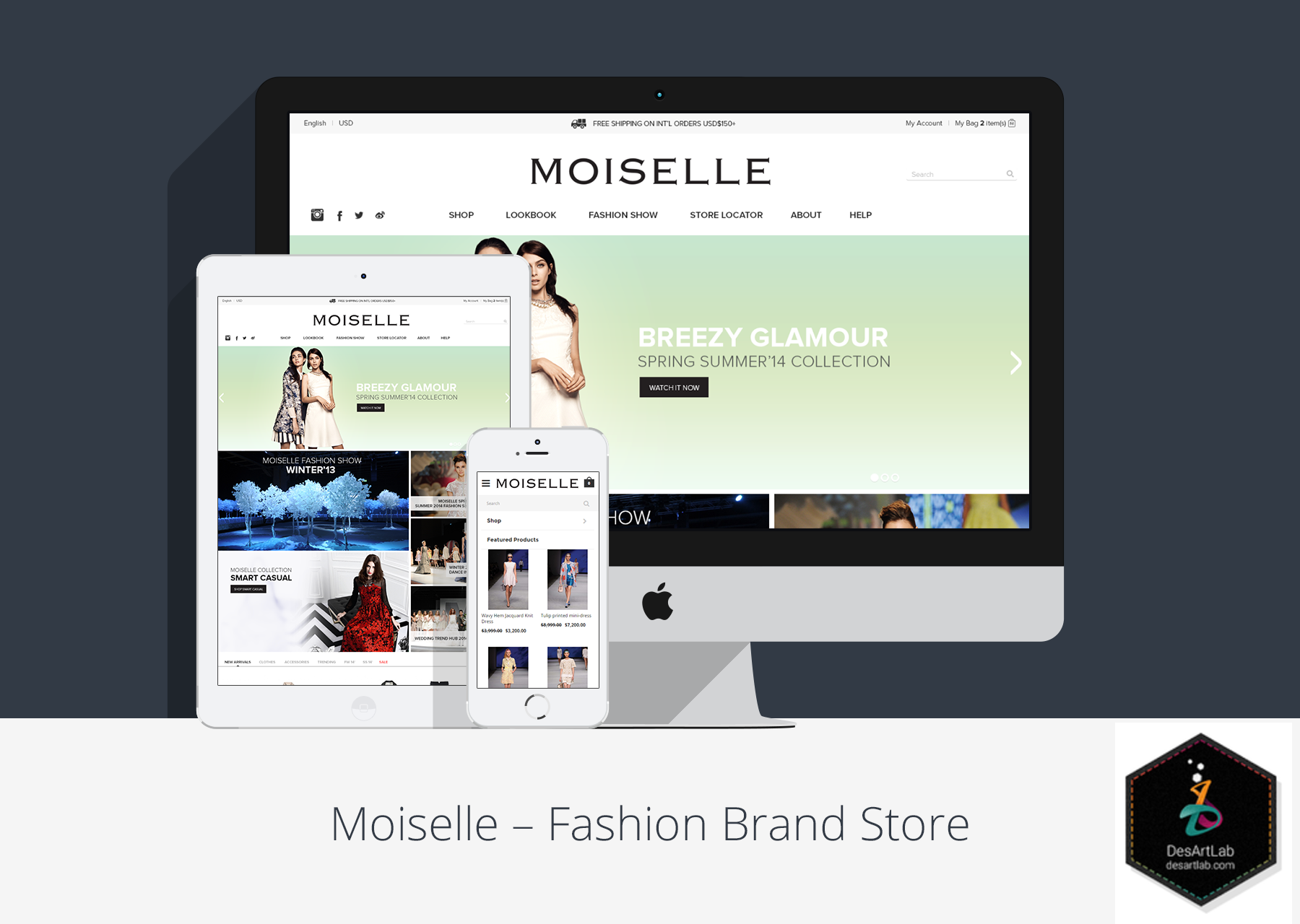
A responsive website is a page that adjusts to all screen sizes and ensures a seamless user experience for users across all devices. As the majority of traffic comes from mobiles, responsive web design is a must for every business that is at its inception.
As a startup, you cannot afford to lose potential clients. Ensuring that the content and pictures contained on your website deliver the same user experience is a must to expand your audience’s pool and to increase your brand’s trust.
Tip# 2. Simplicity
Many startups make the big mistake of loading their business websites with a lot of graphics, pictures, buttons, and options that put a lot of burden on the end user. It is difficult to identify in a cluttered layout the piece of content users need to take an action on the website.
Minimalism is what gives a startup website design a professional look. Getting rid of the information that is not relevant and leaving only the elements that are easily clickable by the users will provide the website with a clear understanding of what to do in what moment.
Tip # 3. Load time
Time is important for Internet users and for you as a business trying to attract as many visitors to the site and to convert them into leads. According to Kissmetrics 40% of people decide to leave a website that loads longer than 3 seconds, 73% of mobile Internet users say that they have dealt with a site that was too slow to load, and a 1-second delay in page response can result in 7% drop in conversion.
According to SEO experts, the best loading rate for a good performing website is two seconds. How to make the website to load faster? There are several things the designer should take into consideration when designing your startup’s web page, to ensure a high conversion.
- Image optimization: Configure the right size and the right number of images for the site. Use appropriate file formats such as GIF for images with few colors like logos, JPEG for images with a lot of colors and details, and PNG for high-quality transparent images.
- Compress and optimize content: Use HTTP compression. When using this function all web page data is sent to a single file. Also use image compressors services as: TinyPNG, JPEG-Optimizer or Image Optimizer.
- Server: Is Google Analytics shows that there are problems with your server, your front-end designers need to solve the problem with the server to ensure that the website performs at its best.
Tip # 4. Reduce color
Color has a great impact on branding. Choosing the color that will identify with your business is not easy. There is the psychological, the geographical, and the preferential element. Different colors have different meaning and affect people in different ways. To choose the color that best suits your business mission you need to firstly understand and define the way your business will work and what its values are.
- Choose colors that match the tone of your business: if your business deals with selling children stuff, bright colors, such as yellow, orange will deliver the fun and the childhood atmosphere. Instead, for a financial website design blue is preferred as it evokes trust, honesty, loyalty, and authority.
- Emphasize call to action: these types of button use bold colors to instigate users to perform a certain action, getting thus the desired response.
- Don’t overuse colors: too many colors are distracting and show a lack of professionalism. You want to position yourself as a startup that knows well what it has to do to accomplish the set results.
Tip # 5. Adaptive content
Search engines index sites based on the quality of the content. It is known that the more content on your website, the more attractive it is for search engines. People like content too. Fresh content, written in easy to read manner, using readable fonts increase the chance for visitors to stay longer on your website and explore more. If, however, your website’s content is obsolete, chances are that visitors will quickly leave.
To ensure that you include valuable information in your startup’s content study your competitors first. See what infographics, pictures, and illustrations they use and try to do it better. Don’t forget about headlines – they must be attractive and bold, capable of capturing the attention of visitors.
Tip # 6. Create a call to action button
The first period of time of most startups’ activity is focused on increasing conversion rates. To see how your call to action performs, test your copy; use a call to action to instigate people to sign up for newsletter or to test a product.
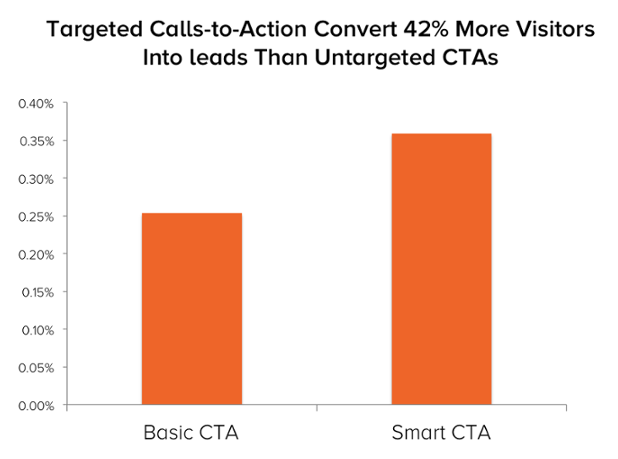
Make sure that the call to action’s copy states exactly what you want your visitors to do. Avoid jargon, as it may be confusing for a certain part of the audience. Instead, stick to powerful words that will encourage people to take that action without a second thought. Because personalized calls-to-action convert 42% better, use “you” word more and you will see the difference.
Last thoughts on designing websites for a startup
Being at the beginning of your business path is not easy. But if you work hard and you have your startup web design put in place you’ve traveled half the way to success. It is no physics formulas, but if you do your research and implement the best practices, everything will come easier.


