Whether in a bus to school or college, in the park, or at the gym, people use mobile devices to surf their favorite websites and be up-to-date on everything that happens around the world.
According to a Harvard Business Review article, a person interacts with his/her mobile device an average 150 times per day. And when we’re talking about interacting with the smartphone we mean that the person accesses different mobile applications. Due to the user’s high interaction rate with the smartphone, mobile app designers are challenged with the task to develop user-friendly, user-interactive applications that entice them to click on it more frequently.
A recent study has shown considerable increase in share of web traffic by device.
![Mobile Web Traffic [Infographic]](http://www.desartlab.com/wp-content/uploads/2016/02/mobile-web-traffic-infographic.jpg)
The share of web page views from mobile phones is the only direction that has registered growth as of January 2016.
Mobile apps development tricks that engage users

Mobile-friendly is past the point. It is time to get new possibilities that mobile devices offer on board.
Every business that is interested in expanding its reachability needs to consider the option of business mobile app development. It is a sign that you care about your customers and that you think of a comfortable way for them to get access to what you have to offer.
Mobile applications must ensure outstanding UX from the first time users click on them. There are several tricks that will help you in your journey to developing an application that your users will fall in love with.
Develop for the offline
Ask every mobile user what they find most frustrating when engaged in an app, and you most definitely will get the answer of not being able to benefit from its usability when there is no Internet connection.
Ensure that consumers get the same functionality from an offline, as from an online app. This is something that needs to be considered and thought about by you and your team of app developers.
Avoid clutter
Clutter doesn’t go hand in hand with easy user navigation. Avoid adding too many features. Your app should serve a simple, single purpose to be able to ensure great user experience. More importantly, concentrate on the relevant content for your app, which will boost brand engagement and brand trustworthiness.
Read this: 10 Psychological Aspects of UX Design
Know your user’s motivation
You need to understand the thing that motivates the users to keep clicking through your application and put triggers in the right places, to maintain their motivation long enough for them to sign up or log in. If you don’t associate with their expectations, your attempts at getting conversion and growth are bound to fail.
Keep it simple
Users expect to have an easy-going interaction with the application you put at their disposal. Think of the UX of those who are not technically savvy – how effortless is it for them to interact with your application?
Embed the minimalist style and stick to it. Too many menus to navigate through just to get to the feature the user is looking for is a turn off. Users will likely stop using the mobile apps as soon as they have downloaded them just because they don’t relate to its complex functionality.
Provide multiple login options
There are multiple social media websites that a user is signed in to. And remembering a multitude of login and password combinations gets confusing. Also, signups don’t offer too much value to the brand.
Login option with the other social media accounts is an instrument that is more likely to be used by users. However, make this option pop up once the user hits “like” or “share” button, which means that he/she is sufficiently engaged with the app.
Cover multiple platforms
When developing a mobile app it is imperative to cover as many platforms as possible. Thanks to the large number of mobile devices that have invaded our lives, users shift from smartphone, to tablet, to desktop during the day. Therefore, a larger availability of your application across different platforms means greater reachability.
Having the functionality and capability to engage users is half way to success. Now that you have identified and decided what development approaches you must follow to get the best responses, it is also crucial to have a mobile app design that is appealing to the users. It is known that 90% of information transmitted to the brain is visual. Therefore, consider to adapt beautiful, and at the same time intuitive and smart elements that boost user conversion.
6 Mobile design elements that appeal to the user
We’ve put up 6 appealing design elements, which, smoothly integrated into the app, give it a posh feel.
Clarity
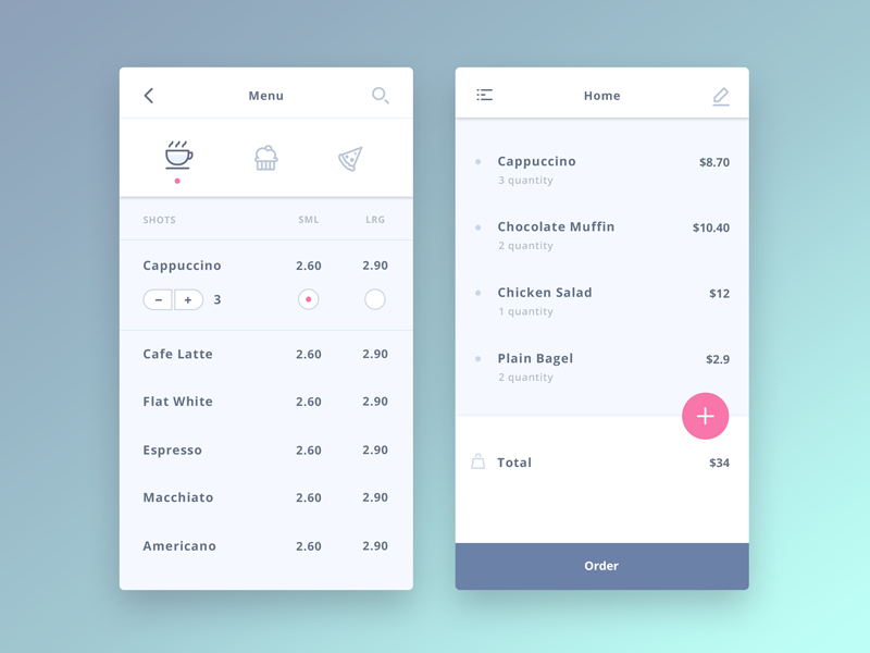
It is probably one of the most essential elements of a mobile app design. You don’t want to overwhelm or confuse your user. It must shout what the user can and can’t do. It must pave the way for the user in finding the feature and functionality he/she wants in no time. Therefore a clear, clutter-free UI is highly advisable. The interface must be visually appealing, yet simple.
Flexible filters and search feature
If you want your mobile app to be a certain informative catalogue, specialized in a specific industry, such as music, art, or restaurants, flexible filters and search feature will definitely come in handy. They allow the user to use these elements to see only the information that he/she is interested in. Also, avoid including too much information for each category, just to not bore the user. Two-three sentences are enough for him/her to get an idea of what the category holds and decide whether to proceed or keep on filtering and searching for things he/she wants to find.

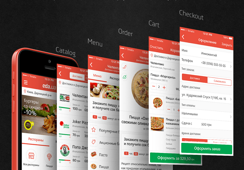
A good example of an application with filters and search features, that help users navigate smoothly to the category they want
Navigation bar
Avoid overloading the navigation bar. Keep in mind that you design it for a smartphone screen, which eventually might turn out to be too packed. Instead, keep it smart and simple. Add only major sections of the apps as tabs.

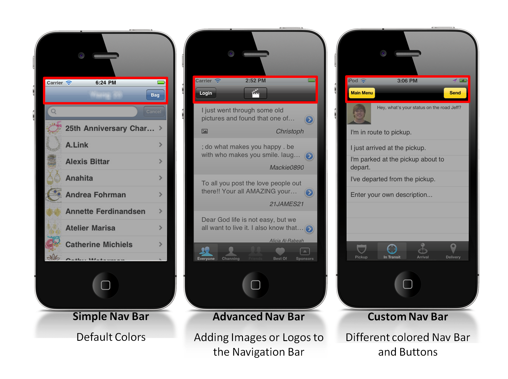
There are three types of navigation bars that look neat. Implement the one that best suits your mobile app’s personality.
Translucency
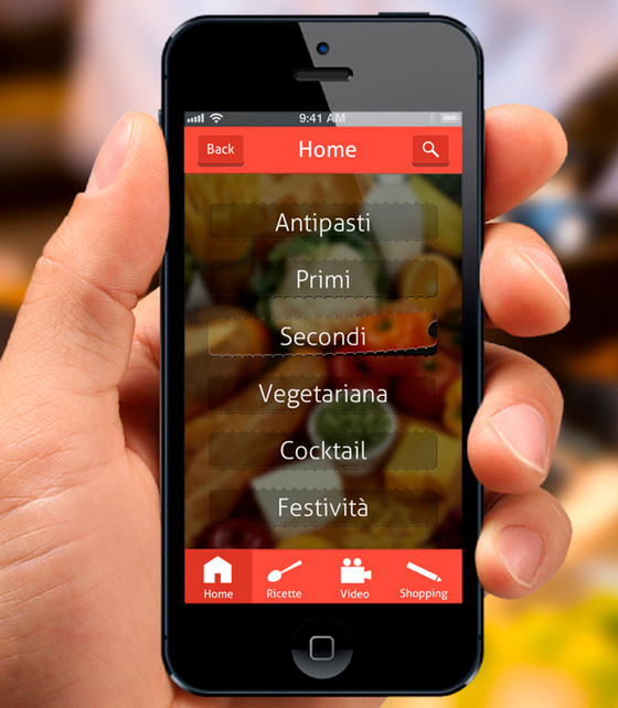
Translucency and transparency elements give the mobile apps a chic touch. Using an unfocused photo or a blurred image as background in combination with the transparency element you set a proper feeling and mood. Furthermore, translucency allows users to know where they are in the app and makes it possible for them to check out other app features without the need to leave the page.
Customization feature
Users like when they have the freedom to customize the application according to their liking. Several customization features, such as color, fonts, and privacy settings are things that give them a feeling of ownership.
- When considering embedding customization features, you should keep in mind the following;
- All customization choices must be attractive and in line with the usefulness of the application;
- There must be customization choices for change of color of the app’s skin and other of its parts;
- The user must have the possibility to keep only the features that he/she wants to keep.
Read this: How Colors Can Impact Website Success
Social media integration element
Major social media integration contributes to the mobile app’s popularity and makes it more lovable by users. This feature facilitates sharing user’s pictures, videos and texts directly from the app on his/her favorite social media.
See a detailed infographic, designed by YMEDIA LABS, showcasing design experts advice on how to create amazing mobile design.
Conclusion
Mobile apps design is a huge deal for your business if you want to reach a larger audience. This tricks and tips about appealing design elements will certainly make the deal if you keep them in mind and implement them in the apps. Because when it comes to user experience and user interface the biggest thing lies in the simplest, but glossy details.


