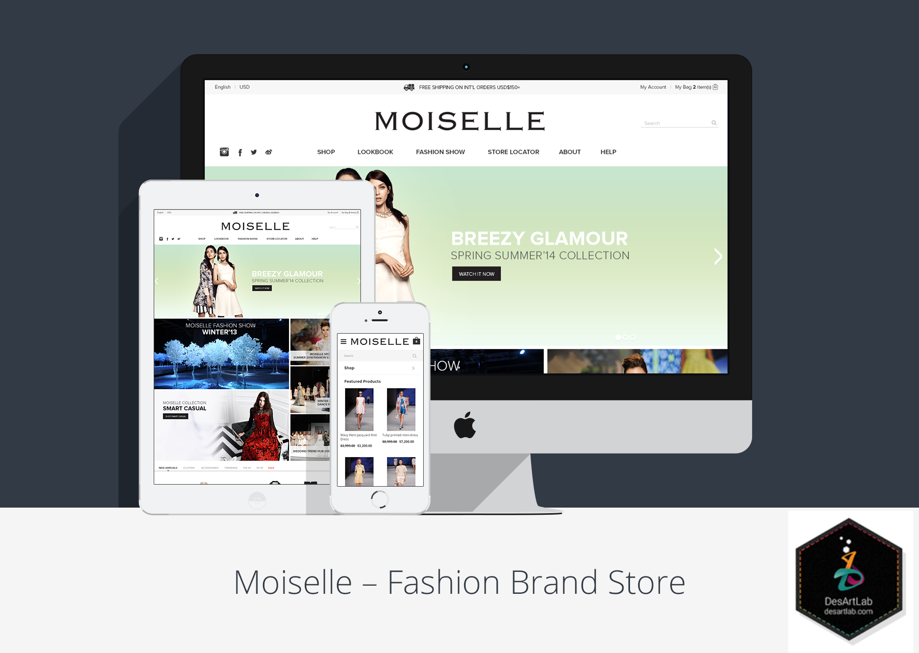
E-commerce websites’ popularity among on-line shoppers is only increasing year after year. Creating an e-commerce website design that responds to the users’ needs ensuring a seamless experience and easy navigation are the crucial features to attract a larger number of buyers on your on-line marketplace. Regardless of the products your company sells, there are web design trends which jointly increase the site’s popularity, and as such the company’s ROI.
Know your customers to create a website that meets their expectations
When designing an e-commerce website always keep in mind the experience and habits of your potential customers. A well-designed, easy-to-navigate website is the proof that the company cares about the experience of its customers. Therefore, tailor the page to facilitate shopping experience and thus to increase your customers’ loyalty.
Online marketplaces are seen as a convenient shopping tool by many people across the world. They offer the advantage of running your errands without the need to leave the comfort of your home. However, you must keep in mind that the online marketplaces don’t deliver the same experience as the traditional stores do, such as touching the product, trying it on to see if the size fits, tasting it and so on. For this, however, web designers use other tricks to make sure that the online shopping experience lives up to the buyers’ expectations.
Here are 5 e-commerce web design tips that popular web design agencies put into use
#1. Card design
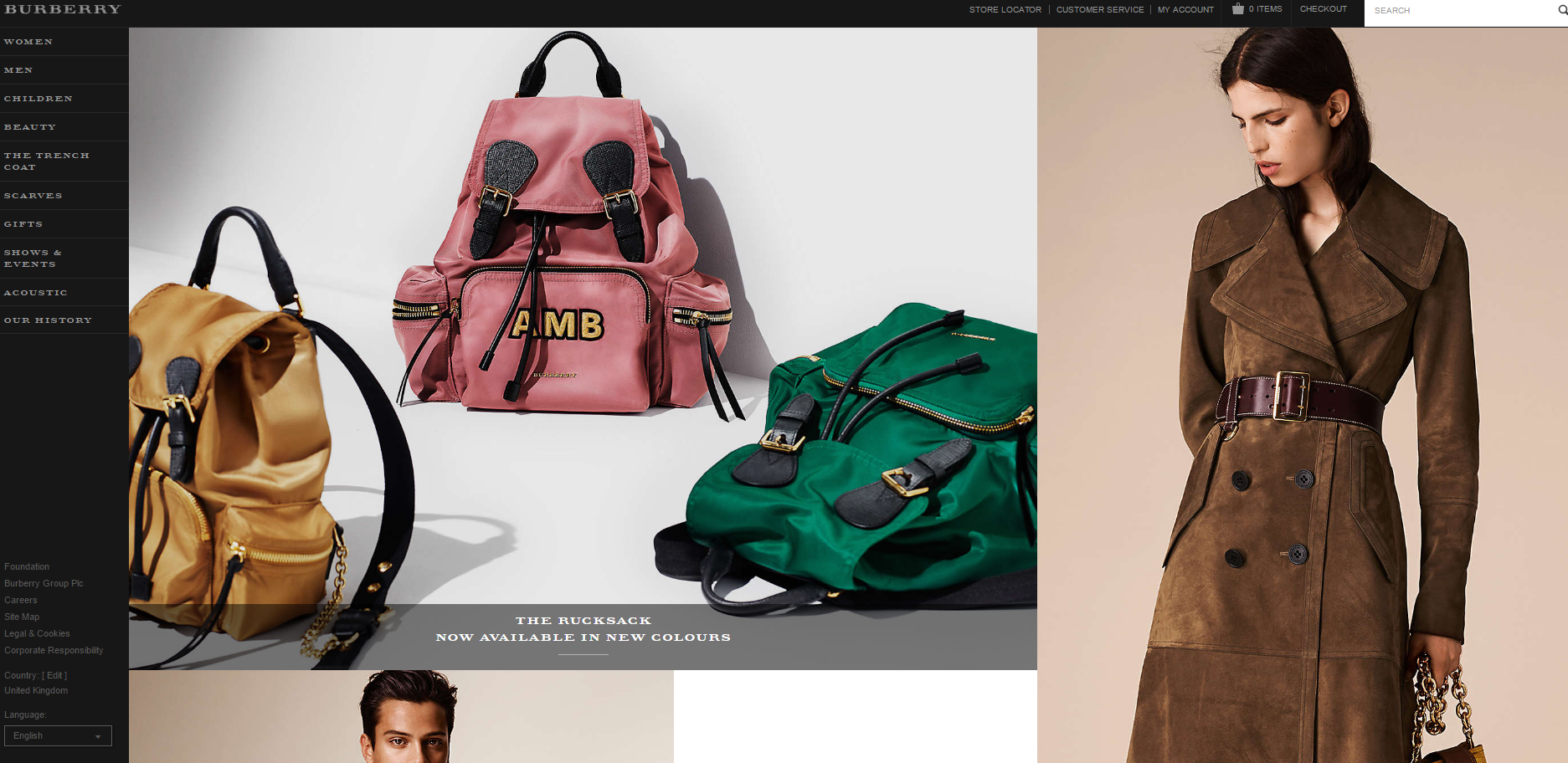
Card design is the new biggest thing in e-commerce web design. It is easy to use and appealing to the eye. What’s more is that card design patterns are of a different kind: floating, tiles, stack, and layers. The advantage of these types of website patterns is that they can point the user’s attention to the new collection or it is a creative way of announcing a big sale coming soon.
Another thing that goes with card layout is the user friendliness and the fact that they work great with responsive. Is there anything more to wish for?
# 2. Large typography
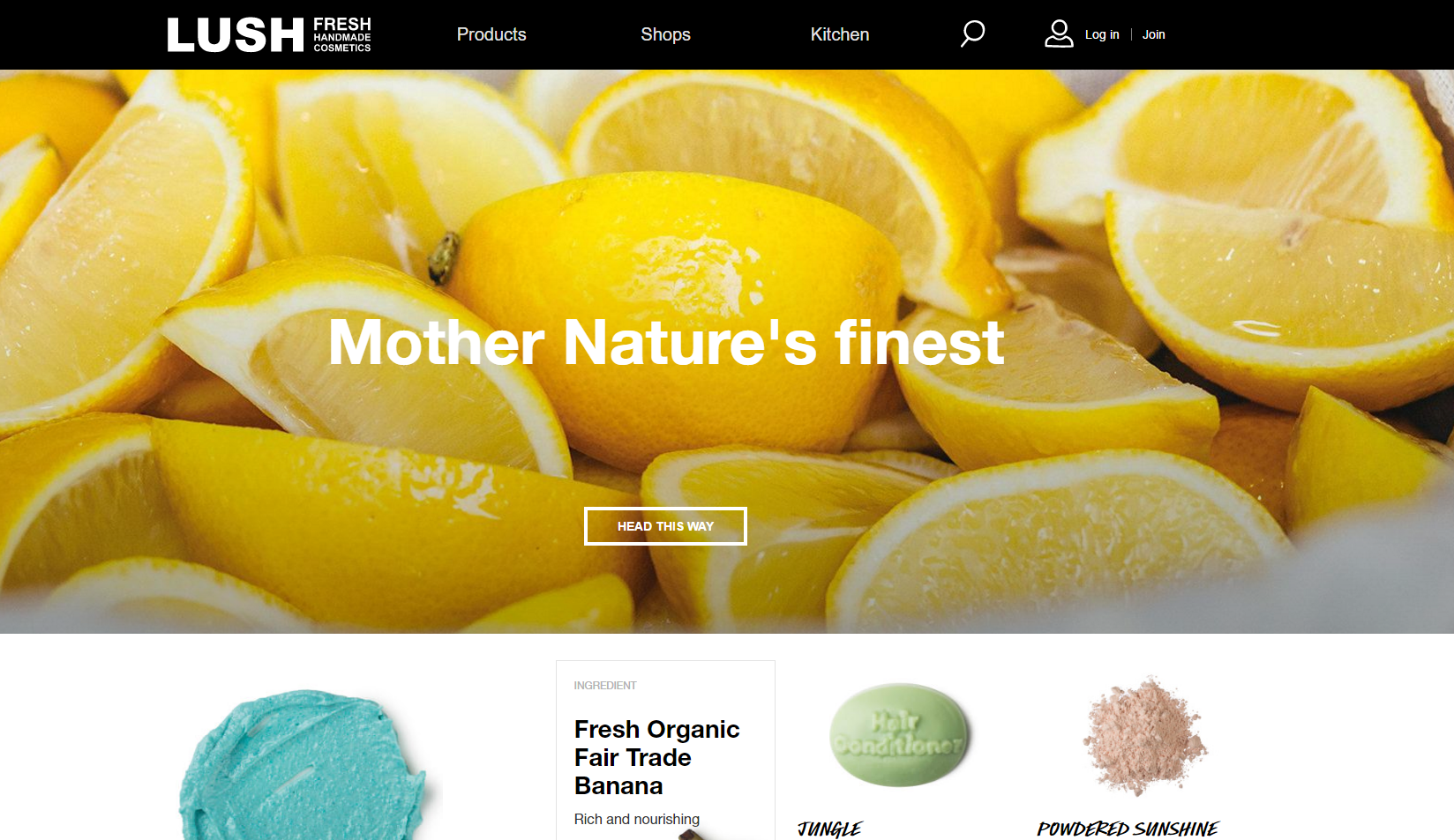
Typography plays a special role in e-commerce website design. And when it is large, responsive typography that can be viewed across all screen sizes without interfering with the user experience, typography has the power to win over a customer. Large typography is used in e-commerce web design to point buyers’ attention to certain products, emphasizing the product’s appeal, and plays a crucial role in brand identity.
See how Lush is using large typography to make a statement about its nature-inspired ingredients and products.
Read Top 5 Reasons to Redesign your Website Now and start working on it without delay.
# 3. Large photography and video
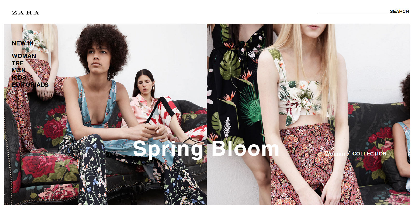
Large photography as background and video speak a thousand words without using any. And they represent a creative way to communicate the products’ story. A high-quality picture has the capacity to attract attention and to focus the viewer on its visual description. An e-commerce website that features these types of elements is more likely to compel the buyers.
Zara combines large photography and large typography to create an alluring e-commerce web design that is inviting and that invites the customer to explore the products that are hidden behind these artistic tools.
# 4. Motion animation
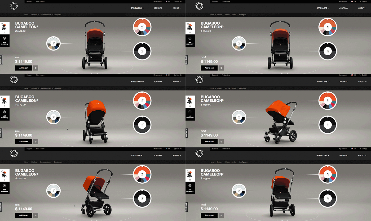
Animation is a great way to engage users. And when used in the right place and at the right time, animation can make user experience memorable and make costumers want to spend more time on the e-commerce site exploring all that it has to offer.
Motion animation is a perfect attention-grabbing means and adds interest and intrigue to forms, CTAs and menu items.
# 5. Responsive design
Responsive design is a must trend for any type of website. Regardless, if it’s about your corporate, startup, or e-commerce website, responsive cannot be avoided. According to a study, it is projected that from 2013-2016, the UK average compound annual growth for mobile spend will reach 36% vs. 10% for overall online spend.
Mobile device users make up a large pool. Therefore, it is crucial to design a performing e-commerce website that will deliver sky-rocketing results.
How to create an e-commerce website design that attracts more customers?
E-commerce websites have a very well-defined purpose – to sell a range of products. It is no secret that a beautifully designed, fully functional website has the capability to attract more customers than a website that has no personality.
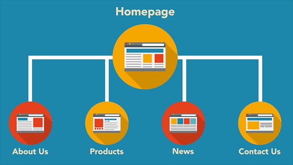
It is important to know about the audience’s navigation habits so that the navigation experience on the site is tailored to meet their expectations. A cohesive navigation plan will guide your customers and help them find what they want.
Avoid confusing the customers by designing a cluttered navigation. Keep to the simple navigation structure and make sure to use a clear and simple navigation bar that appears on every page of the website.
Read 6 Expert Startup Website Design Tips and see what it takes to create on-line presence for a new business.
Focus on making shopping easy. Add multiple “Add to cart” buttons, create bright color and clear CT inviting and encouraging customers to add products to the shopping cart. Help your customers complete the checkout process in a frictionless manner.
One more great approach at winning customers over is to create an organized e-commerce website, just like a premium common retail store. Adding high-quality photos of the products makes sure that the customer has the possibility to see the best of the product you are selling. Avoid using boring and traditional website layouts based on static product catalogs. Instead, focus on creating interactive galleries and sliders.
In the infographic, you can see the roadway to designing a custom e-commerce website that will help you deliver a customer-oriented product.
Conclusion
These 5 simple, but extremely popular tips of e-commerce web design will help you create a performing website with an awesome user experience. The more you concentrate your web design to satisfying costumers’ expectations and facilitating their interaction, the more your site will generate positive results.


