With the flow of time shopping became something that we like to do in the comfort of our home. Why wouldn’t we? E-Commerce websites offer multitude of useful options, such as comparing items, looking through the product’s descriptions and their preview, comparing prices and so on.
With the help of the well-designed e-commerce website you can find and order anything you need. However, despite their identical purpose some E-Commerce websites are popular and can boast of having terrific conversion rate, while others are lagging behind, barely making both ends meet. So what determines the success of the E-Commerce website? Pure luck or detailed research into the user experience and usability? Our bet is on the latter, which is why we’re offering 25 useful ideas on how to improve the structure, user experience and usability of your E-Commerce website and correspondingly boost your conversion rate.
- Provide effortless navigation
You need to take into account that your visitors and potential customers are people of different age groups with various educational backgrounds. This is the main reason why you need to make sure that the navigation of your website is as simple as it can possibly be. Besides, one cannot underestimate the pleasant experience users are getting from shopping on the website with comprehensive and smooth navigation. Change that and people will love buying products from your website.
- Create a clearly visible big search box
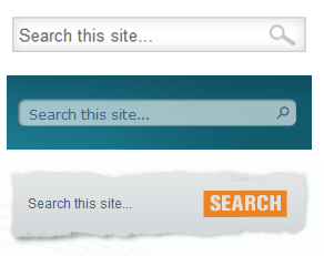
Search box is a vital part of your website as it allows users, who don’t want to sped their time on browsing through categories to quickly find the product they are looking for. Time is everything and sometimes users abandon websites because they consider the process of searching for the product too tiresome. Correct that and more visitors of your E-Commerce website will convert! Moreover, for the better effect you can make it dynamic. For example, your search box can get bigger when user clicks on it, or you can use vivid and juicy colors for its outline.
- Make your website responsive
Latest researches show that more and more people are using smartphones and other portable devices for shopping. What does this mean for you? It means that you need to make your website responsive in order to extend the reach of your business across multiple platforms and devices. Responsive website adapts to any device it’s browsed from and provides optimal user experience. For example, in case the target audience for your website are people from various age and sex groups with various educational backgrounds – responsive will be extremely useful. Thus, soccer mom will be able to shop on your website, using her mobile phone, student will buy something with the help of his tablet and a businessman will make a purchase on your website through his laptop. Besides, responsive websites have the same URLs for all devices, which is amazing for social media, as it facilitates sharing your website with friends or discussing it on social media sites.
- Create comprehensive filters and categories
Your website only has a couple of seconds to grasp the attention of visitors, which is why it is crucial to make a good impression from the very start. How can you do that? Well, for starters your Home page must have comprehensive and detailed filters and categories. It’s an extremely useful feature that many online stores tend to ignore. For example, customer came to your website to find a sweater, he’s not sure which color or model he’ll like, but he wants it to be made of wool and have long sleeves. If he’s provided with the option of checking the “material” box and “sleeve length” box, he’ll feel more confident that he’ll find what he needs and will be more inclined to choose and item from the stock you have, since he will be in control and will get exactly what he asked for.
- Shopping cart
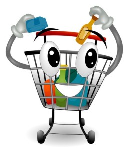
Shopping cart button must be visible at all times. It must be accomplished as an attractive and bright icon that is always near any product, waiting to be clicked. Some online stores even play on customer’s emotions, personifying the shopping cart – giving it sad face when empty and happy face when filled with products.
For example, threadless.com uses this technique by saying:
Your cart is empty, so it’s sad and lonely.
Turn its frown upside down: fill it with stuff!
At first, it may seem like a silly idea, but the thing is – it’s brilliant. People love making others happy, especially if it doesn’t cost them anything. Thus, if they are forced to choose between making a purchase on two websites with the same product and price, people will choose the one with a shopping cart that smiles, after they put something in it. Smiling shopping cart provides feedback and we all just love to be rewarded even if we practically haven’t done anything to deserve it.
- Make “Check out as guest” option available next to “Sign in”
You should keep in mind that people don’t like to commit to something and they don’t do it easily even if they have to. Especially, if they are visiting your E-Commerce website for the first time and have no experience of using it. If they are forced to sign up to place an order, half of them will simply abandon your website, as they won’t be inclined to share their personal information. Which is why you can be smart about it and offer them a possibility to login, using any account they have on social media, such as Twitter, Facebook, Google+ and so on.
- Replace “Buy now” button with “Add to cart”
Every business owner wants to sell as many items as he can, but how can one do that? The secret is in tiny call-to-action buttons. For instance, “Buy now” button will simply redirect visitors to the payment page, after they choose only one item. However, if you use “Add to cart” button instead, they will be more inclined to add something else in the cart. Changing call-to-action buttons is very simple and can be accomplished easily, but the result can surpass the wildest expectations!
- Use a simple, one-page checkout process:
If your efforts became fruitful and your visitor finally decides to convert and make a purchase you need to make sure that the checkout process is as smooth as it can possibly be. Complicated checkouts on multiple pages are annoying and can irritate user, making him abandon the shopping cart and everything in it. You certainly don’t want that! Therefore, you should choose one-page checkout process to facilitate your website’s usage for visitors. Smooth and seamless transition to the payment page can do wonders for your conversion rate.
- Provide easy way to change items in the shopping cart
If your customer made a mistake by choosing the wrong size or color of the item and wants to go back the net browser connection will be lost and he may reconsider using your website. However, in case you provide an easy option for changing items, client’s experience will improve and he will be much more inclined to proceed with changing items and paying for them. In order to provide a way to easily change items you can add “remove” button to delete the wrong ones and pop-up window of the product’s page to choose the correct size or color.
- Indicate the delivery fee on the product’s page
Research shows that people perceive the delivery fee better, when it’s indicated on the product’s page. Showing it near the price of the product eliminates the negative surprise element by the end of the shopping process. However, if user doesn’t see the delivery fees from the start and is slapped with a pretty penny during the checkout process he will feel himself deceived. Nevertheless, one must keep in mind that is the fee is indicated in bit letters and right near – customer may think that it’s too high and abandon his purchase. Therefore, it’s worth to indicate it in small letters and digits below the price of the product.
- Don’t forget about the SEO
Up to this moment we were discussing ways to improve user experience when your customers are already on your website, but how do they get there? How can you attract heaps of potential customers, boosting your overall turnout? It’s all about the SEO. Search Engine Optimization helps to get customers on your website. If you enter your meta description and meta tags correctly and suitably to the products you’re selling, people will find your website much quicker, which in its turn will boost the overall turnout and conversion rate.
- Make your website strikingly attractive and unique
The majority of the websites are oriented on a specific sector of E-Commerce. For example, if you’re selling chairs, make sure that overall design of your website corresponds to the nature of your business. If you are a startup, then you can use unusual and interesting ready-to-use templates. However, if your business is dong fine or even better than that – you can definitely go for a custom design, which will pleasantly surprise your target audience with its exclusivity and novelty. You need to make sure that your E-commerce website will have something that no other website of the same nature has. The most important thing is to stand out.
- Personalize your recommendations, using browsing history
Personalization is a cornerstone of successful sales. People like to be treated personally. They will definitely be pleasantly surprised if your website will offer them things that are up to their liking. For example, if the customer searches for cat toys, you can modify your recommendations to offer him related products, such as catnip, cat beds, pet shampoo or cat food and vitamins if you have them in stock. Moreover, you can modify your recommendations to take into account the location of the customer. Thus, if you have several offline stores near his location, you can recommend products that are currently in stock there. Personalized experience is highly appreciated by customers and can considerably help in increasing your conversion rate.
- Neat and clear product page
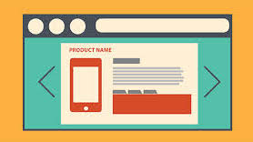
The outlook of the product’s page plays an important role in customer’s decision whether to make a purchase or not. Product’s page must be clear with concise, yet detailed description. There is no need to write stories or litter this page with unimportant stuff – only essential information, necessary for better understanding of the product’s functions or features. No one wants to read through the pages of information, it’s tiresome and diverts the attention from the product itself.
- Clearly indicate product variations
In order to prevent customer’s mistakes, your product’s page must be very specific about the products variations. For example, if you’re selling T-shirts, the page of each T-shirt must contain an option to choose size and color. You can also add additional window that pops, requesting the confirmation of the chosen size and color. Thus, customer will double check the product he ordered and will be less likely to modify his order in the shopping cart.
- Provide product preview
When customer finally finds the product he’s been searching in the web on your website, he wants to make sure that it’s exactly what he wants. To help him do that you need to provide qualitative product preview. Some websites offer 360° views of the items. That’s an amazing strategy, because no words can describe an object better than a possibility to view it from all angles, specially if it’s an expensive watch or a jewelry piece.
- Provide appealing images for your products
You definitely want customer to see your product in the most advantageous light, which is why you need to provide qualitative photos. But not just any photos. It must be the photos, presenting your product in the best possible light. For example, if you’re selling clothes – get a couple of good-looking models to showcase them for you. Despite the fact that this process takes time – it’s very efficient for boosting your sales. Positive and friendly-looking faces will always create an appeal, customer will be associating this product with a friendly face or cool-looking photo. Remember that great presentation of the product may raise its value. Thus, even average sweater may look like it’s a brand designer clothing.
- Show product’s availability correctly
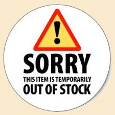
In terms of E-Commerce SEO is a god, which is why the rules of internet marketing speak against removing out of stock items from your products’ catalogues. However, the reverse side of the medal will be the customer’s irritation and disappointment upon finding that the desired item is out of stock. This is exactly the situation, where you can offer a replacement product. Despite the fact that the majority of customers, will certainly choose to continue their search on other websites, some of them will go for the offered replacement and this is much more generated conversion than you would have had if the page of this item was removed from the catalogue.
- Promotions and free shipping
People love free stuff – it’s in our nature. Which is why promotions and free shipping is a sure way to attract lots of new visitors and convert them. If you make a promotion – your home page must clearly state it and have a link to the promotional products, so that the exited customers know where to buy them. Make sure all the pages of your website have bright and noticeable banners.
Free shipping is another way to attract and convert heaps of customers. The majority of the retail stores simply adjust the price of their products to include shipping price. However the very Idea of free shipping makes customers perceive the price much more tolerably. Some even consider free shipping a rare opportunity to buy as much as possible. Besides, buying online is cheaper than shopping in brand boutiques anyway.
- Provide human feedback via Live Chat
Installation of the live chat software will help you analyze how the traffic is distributed on your website – which pages are visited more frequently than the other. Apart from that – people will be able to discuss the terms of the purchase, get recommendations from the customer support agent and find out the status of the order in case your website does not support such an option. Support agent can convince a hesitant customer to make a purchase by listing its advantages and explaining its features.
- Make FAQ section easily available
In the ideal world your customers wouldn’t have had any questions and would proceed with the purchases without problems. However, we live in the world where your customers come from various age groups with various educational backgrounds. You need to explain how your website works in a very simple way, just like you would explain it to a 6 year old. Frequently Asked Question section must include information about shipping, return policy, privacy policy and guarantees.
- Make “Contact Us” page clearly visible
No reliable and decent website can do without Contact Us page. If you want your customers to trust you and eventually sign up, you need to make yourself available for them. Besides making your Contact Us page prominent and informative, you must set up customer service, so that customers can reach you 24/7
- Show customers’ feedback/testimonials
Assuming you’re an owner of successful project, you’ve probably heard about the importance of personalized e-mails and e-mails, asking for customers feedback. Use these e-mails to invite customers to leave feedback for your products on your website. Words of praise and trust will make other customers fee more secure on your website, which increases the chance of their conversion.
- Create an appealing “Sign-up” for News Letter button
Database of qualitative e-mails is a goldmine for every business. However it’s quite hard to create one, especially for startups, aspiring to become well-established businesses. In order to build such a database you need to motivate your visitors to sign up for promotional letters. This call-to-action button must be designed is a way that appeals to the target audience. Make it friendly and cute, so that the customers would want to click it.
- Links to Social Media
Currently, social media can be considered the driving force of internet sales. Over 20 percent of online sales are accomplished via Facebook and Twitter. Therefore, it is essential to expend your presence to these social media websites. Moreover, they present a magnificent chance to promote your business as they possess integrated marketing possibilities. It’s a magnificent way of informing your target audience about your promotions, seasonal sales and other exiting news you want to share with the public.


