The second thing that must be taken into account is the guests that will come to your restaurant most often. To identify the target group, you must analyze the surrounding where the restaurant is located and the cuisine it will offer to the guests.
Read How to Design for a Particular Target Audience
A restaurant website must give the potential guest the opportunity to become acquainted with the menu, the location, the ambience, the style and the service. It also means that you are open for online orders and reservations.
Your restaurant website is its business card. It is recommended to be appealing, to inspire coziness and to elevate one’s appetite. The way they will work for your business depends on how you will present all these concepts in the website design.
Here are 7 restaurant web design tips that you can use, if you want to make it a success.
Restaurant Web Design Tip #1: Keep the website simple
A well-designed website shows the professionalism of the business. This is applicable for restaurant website design as well. It is even more applicable to them, as these types of websites are usually cluttered with pictures and videos, sometimes of poor quality. Or the navigation is too confusing. Therefore, make sure that your website follows the standard structure: the main page, the menu page, the ‘About us’ page and the ‘Contact us’ page. These are the main ingredients for a complete website page with a well-structured online presence.
Restaurant Web Design Tip #2: Make a creative and informative “About us” page
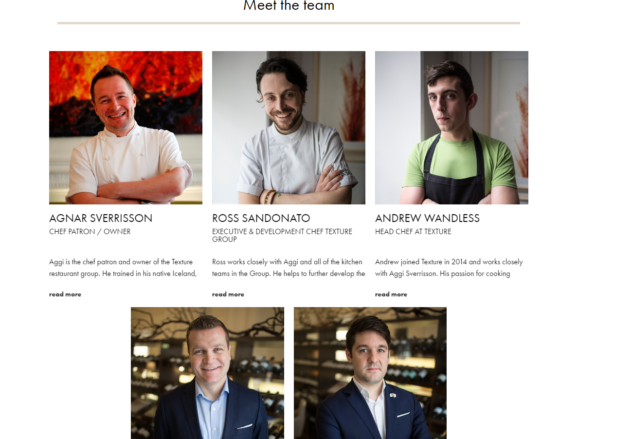
The “About us” page is usually the most read page of any website. It is where people get acquainted with who you are, what you do, how you do it and the reason you’re doing it. Also, the “About us” page is designed to win you visitors and make you stand out from the crowd. This page is also the place you can introduce your restaurant’s staff, emphasizing their professionalism and friendly attitude to the guests. Here you can include pictures of the chefs and serving staff, making sure that they are smiling and look inviting.
Restaurant Web Design Tip #3: Include online menu
As an Internet user who has just recently found out that a new fancy restaurant opened its doors for the visitors, I would like to go online and check the menu and the price range. Therefore, the idea of providing a web-based menu is totally for the sake of gaining new guests, and not only. Whenever you plan a dinner out you would turn your computer on and start rumbling through restaurant websites to decide for what food you are in the mood. An online menu gives your guests the chance to look through it, decide if you cater the meal they want to enjoy on a certain day.
Make the online menu easy to read. Avoid uploading PDF scanned menus. It shows that you lack inspiration and are not eager to spend time to think of a better option to make the menu available for Internet users. Instead, use column menus, broken down by types of meals: breakfast, lunch and dinner with the items, photos and prices.
Restaurant Web Design Tip #4: Add appetizing pictures
Images are the best way to attract attention and make users click to find out more. For this, however, the images must be of high quality and attractive. Restaurant websites use usually two different kinds of pictures:
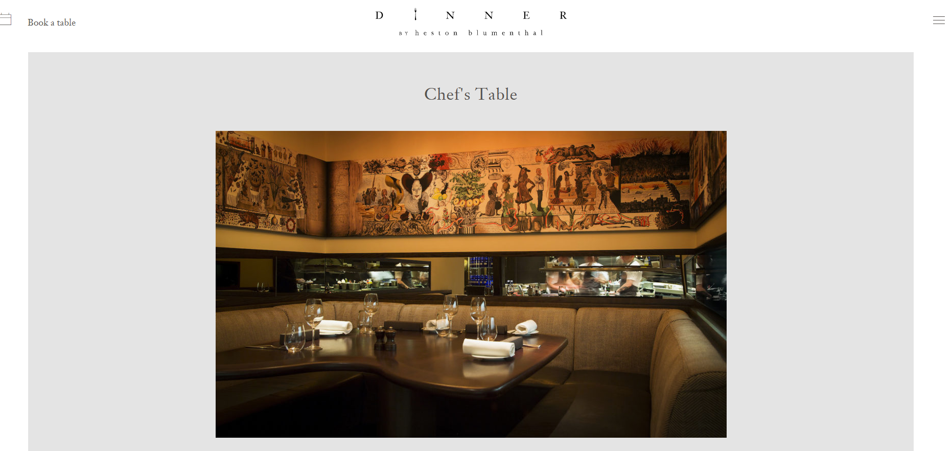
- Large background images, showing the atmosphere in the restaurant. These are pictures of the restaurant’s interior, showing the cosy and inviting environment;
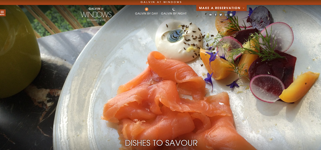
- Food pictures. They can be added to the online menu, making it more delicious and thus waking up the appetite. If their purpose is achieved, guests will roll into your restaurant in no time.
Restaurant Web Design Tip 5: Focus on color
Color, just like images, has the power to grab website visitors’ attention. Plus, there is a color palette that can raise the appetite and which is used with success by catering businesses. Such colors are red, white, black, and brown.
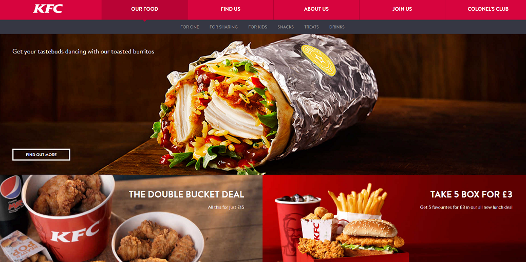
Red is mostly used by fast food restaurants, as it signifies passion and desire. Such an example is KFC fast food restaurant websites, where color red predominates.
Color white symbolizes purity and freedom and has found its use in restaurant websites design.
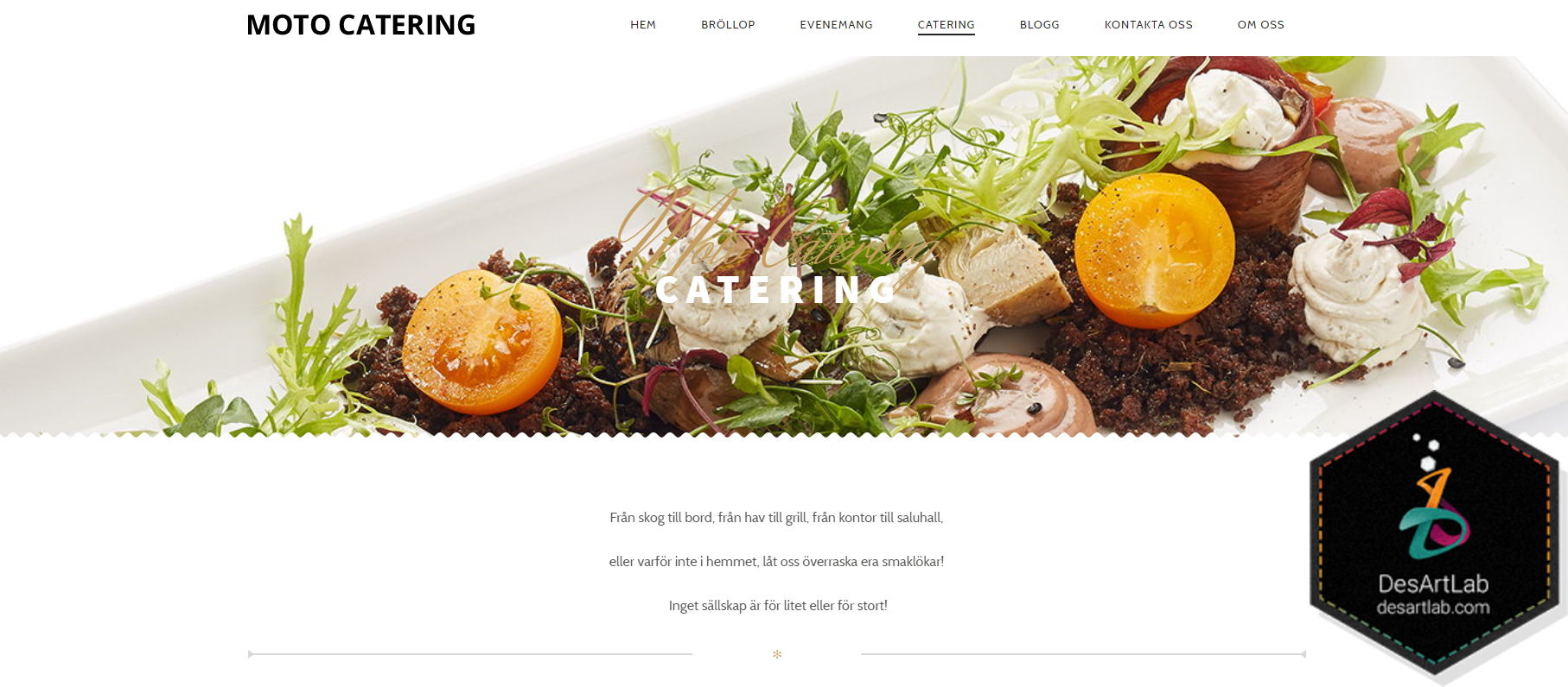
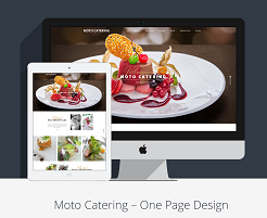
Moto Catering restaurant website, designed by DesArt Lab, employs color white in a beautiful manner, putting an emphasis on the feeling of freshness.
Black is another color that has gained popularity during the recent years, especially in the restaurant business. Color black is associated with mystery. Moreover, food photography looks great on a black background.
For more details on color palette for websites read our blog post about How Colors Can Impact Website Success.
Restaurant Web Design Tip 6: Make online reservations user-friendly
Online reservation form must be simple and to include the most important information. Avoid designing overwhelming forms, with too many fields to fill in. This will scare your guests off. Let them know that the doors of your restaurant are always open for them.
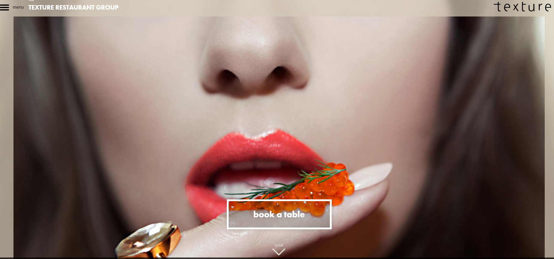
Here is a good example of table reservation button and form on Texture website.
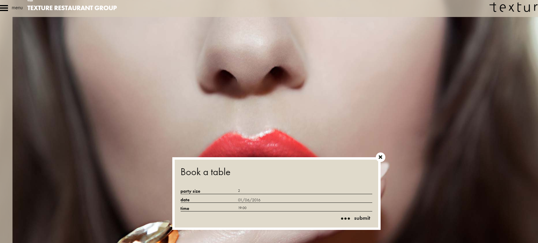
This is how the reservation form looks like after clicking the button. Party size, date and time is all that the restaurant requires you to fill in.
Restaurant Web Design Tip #7: Design an informative “Contact us” page
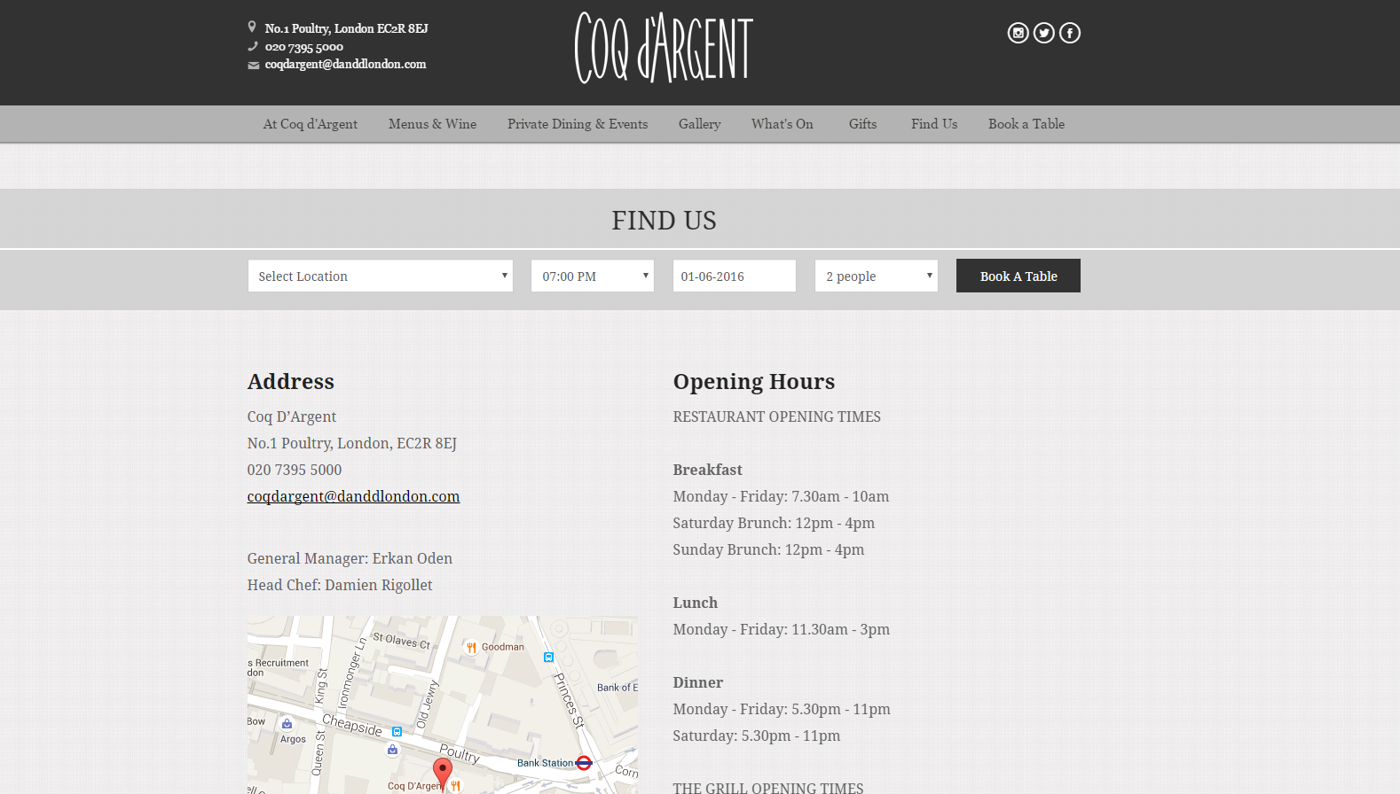
Every business with online presence should have such a page on the website. This way you make yourself easily found by your visitors. Contact us page should include more than just an email address and a telephone number. Consider providing a detailed physical address of the venue, a Google map showing directions to your location and opening hours of the restaurant.
Coq D’argent restaurant website has a very detailed Contact us page, where the guest can easily learn a lot of information about the restaurant’s address and opening hours.
Conclusion
Regardless of your restaurant’s target audience, it is imperative that its website design looks “delicious”. Make use of these simple tips to ensure that your restaurant is in line with the trends of this time.


