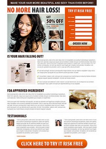
Designing a competition-crushing landing page implies looking deep into the psychology of the customers, identifying what they really want and finding the way how you can offer it in a customer-oriented form.
There is no step-by-step guide to crafting a killer landing page. There is, however, the concept that every landing page has differentiated elements and a certain goal. Keeping in mind the goal you want to achieve with your landing page will help you focus on the elements that will stand it out from the thousand landing pages that pop up daily.
So, what exactly separates an optimized landing page with conversion rate success from a regular landing page?
Best practices that commit to converting prospects into leads
Best practice # 1. The more, the better
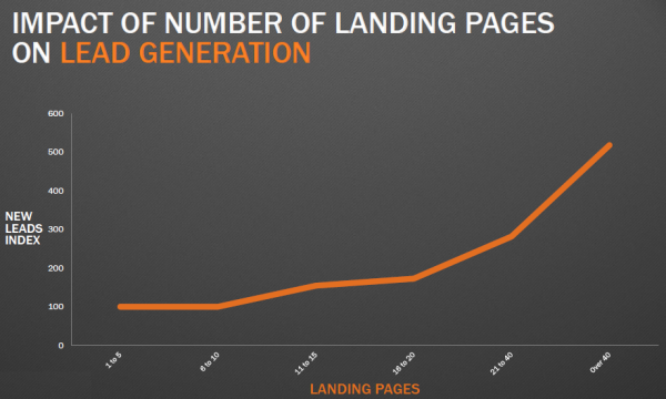
More isn’t always better. But this is not the case with landing pages. More landing pages means better chances to get found, to gain leads, and to increase conversion. Of B2B companies that use landing pages, 62% have six or fewer total landing pages. According to a study conducted by HubSpot, businesses registered a 55% increase in leads when putting in place more than 10-15 landing pages. Having more landing pages to your website increases the chance to skyrocket conversion rates.
Facts speak louder than words.
Best practice # 2. One offer only
Landing pages with multiple offers get 266% fewer leads than single offer pages. To get a bigger chance at gaining new leads, focus your landing page on a single purpose. First things first: identify the audience you’re designing your landing page for. Knowing the audience will give you a hint of what to pay attention to and to gear all your efforts toward achieving it.
Design the landing page to promote one product or service. Emphasize on the product or service’s purpose with a strong message that will attract potential customers. Research your competition to get a fair idea of how they are doing it, and then do it differently. Bring all elements that the landing page contains in perfect synergy with its goal.
Best practice # 3. Magnetic headline
The headline is the first thing your potential customer sees and reads. It is the tool with which you grab his attention, heighten his interest in your service or product, and provide a short understanding of what he can benefit from if acquiring your product or service. The headline is the most critical element of the landing page. To make it successful, use these tips when writing a headline:
- The headline should be no longer than 20 words. It is, however, preferably, to keep to 10 words only. The shorter – the better.
- Make it strong – the message that it conveys should grab your reader’s attention.
- Add specific keywords to make it SEO friendly.
- Play with different words to find the perfect ones for the message you want to send. See what words have a greater impact on readers and try incorporating them in your landing page’s headline.
Best practice # 4. Attention-grabbing call-to-action (CTA) button
Call-to-action (CTA) buttons are the elements that convert visitors into leads. They are created with a purpose: to command visitors to make an action. The stronger is the CTA, the higher the chances that your visitors will perform that action. There are several principles in making this command button work for your benefit:
- Make it stand out, using white-space principle;
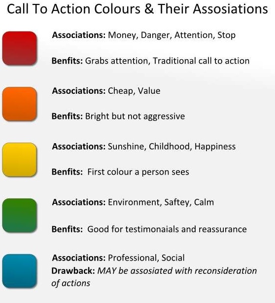
- Use correct color to instigate the visitor;
- Make the button big and position it above the fold;
- Use directional cues to the CTA.
This is how color can impact the clickability of the CTA.
Read How Colors can Impact Website Success to get a thorough insight into the psychology and association of colors with various web design goals and purposes.
Best practice # 5. Use video
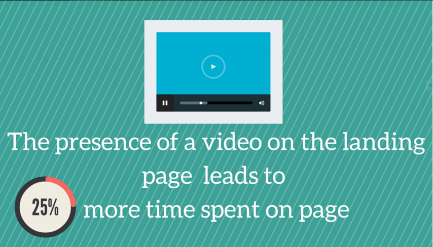
Using video on your landing page is a good medium to engage people in the message you want to transmit, increasing the time they spend on the page in an interactive way. Videos are usually preferred to texts, because people are lazy, and watching a video requires less effort than reading copy.
The video you feature on the landing page will have a greater impact on prospects if it shows company employees, as it increases their trust in the brand. Statistics say that video improves conversion by up to 80%.
Incorporating CTA throughout the video, at strategic moments, and directing viewers to perform the action through speech or text message, is a crucial tool for increasing the likelihood that prospects will click on it. Creating custom videos for a certain audience you address the needs and expectations and answer the questions of that particular audience.
Best practice # 6. Insert testimonials for authenticity
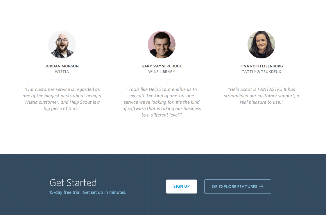
People trust other people’s opinion about a product, service, or even brand. Use your customers’ testimonials to your advantage. Insert their opinion about your company’s products or way of conducting business on the landing page. It will emphasize your strong points and will gain you more leads. If testimonials are complemented with the pictures of your happy and satisfied customers, the probability that visitors will believe in your offer increases significantly.
Here is a good example of using client testimonials on the landing page.
Best practice # 7. Powerful copy
Copy is the king. Copy is the element that glues all landing page features together. All copy used on the landing page in headlines, body text, call to action, and forms must match perfectly and address one single goal. Write strong beginning and ending paragraphs, to stress on the offer’s advantages.
Keep the paragraphs short, and use bullet points when needed. Write action-oriented content and keep your visitors engaged throughout the entire text. Don’t overwhelm and scare prospects with long forms. Ask them to provide minimum information that will incite them to convert.
If you lack inspiration, read How to Unlock your Creativity and Wake up from a Creative Slumber? to put it to work.
Conclusion
Never underestimate the impact that well-designed landing pages have on the leads conversion rate. To get the most out of this tool, implement these best practices when creating a landing page design for your company’s products or services. Focus on catering to your company’s audience needs and you will be reaping the benefits in no time.


