Sometimes, a facelift of the website plays a very significant role in attracting new visitors and improving the overall experience for your site users.
Good content and a marketing plan are not enough to boost your website performance.
We all know that people are attracted by beautiful looks. This is also the case with the website design. The more beautiful a website is, the more visitors it will have.
Although, don’t forget about the UX and UI.
Here are 5 signs to refresh your website.
1. Slow loading website
The loading time of your website plays a crucial role in keeping the visitors on the site. And it also speaks about user experience – and Google is all about UX.
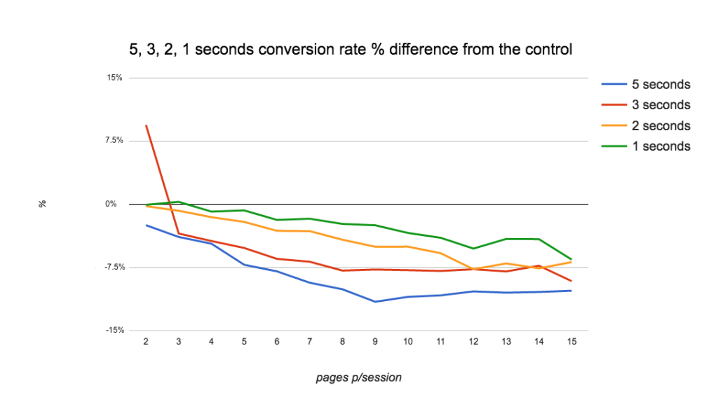
Forbes has conducted a recent study about the loading time of the website in 2016. The chart below illustrates the result:
In summary, it is better to make sure that the website loads as fast as possible.
Read also Top 5 Reasons to Redesign your Website Now
2. Website not responsive
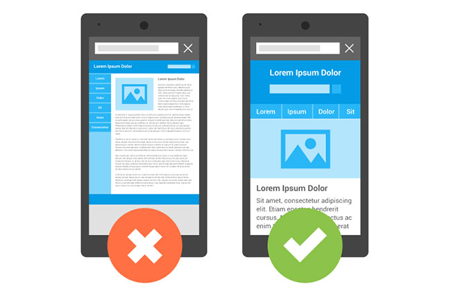
This is another big problem for website performance and conversion. In today’s mobile world, having a responsive website is a must.
A responsive site is the one that adjusts to different screen sizes, without interfering with the user experience. This means that a desktop user and an iPhone user will have the same viewing experience of the site. This means that the mobile user will not have to zoom to read the text on the page.
The lack of a responsive website has a great impact on the user impression of your business.
3. High bounce rate
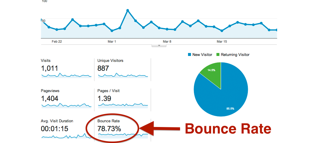
The bounce rate represents the degree of interaction of visitors with the website. The higher the bounce rate, the little users interact with the site. This metrics can be found on your Google Analytics dashboard.
The high bounce rate indicates that the user didn’t find what he was looking for. The user experience on the site was overwhelming and the user left without having a good impression f the site.
The bounce rate can drop down by providing a user-focused experience and interaction on the website. Overall website design, with simple navigation, can reduce the bounce rate. Aim for under 40%.
Read also How Long it Takes to Build a Website
4. It uses Flash
Adobe Flash was trendy some ten years ago. Now, however, websites avoid it as much as possible. It slows the loading time of the website and thus holds back visitor’s entire website interaction.
iPhones and iPads don’t support the Flash and now even Mozilla Firefox started blocking it. Moreover, built-in Flash websites are not indexable by search engines and show countless vulnerability.
5. Website design is obsolete
Although keeping up with the website design trends is pretty hard, nonetheless it is advisable to give a facelift to your website once in a year.
Website design trends come and go and if you want to go with the flow and stay afloat, you should try to incorporate those design trends that better answer your business website purpose and objectives.
Users hate old website and usually get frustrated at the business’ incapacity to provide them with fresh and up-to-date website solutions.
Refreshed website design shows that you have done your homework, you care about your visitors’ experience, and you are always searching for ways to make it even more easy and enjoyable.
Conclusion
These 5 signs to refresh your website are crucial to notice if you want to provide a user-friendly ad user-focused website experience. Give a facelift to your business website to remain on top of visitors’ website choice.


