And since the first impression counts, your homepage design should live up to their expectation and even surpass them.
The website homepage is one of the most important pages. And in order to make it look and perform well, there are several tips and tricks that web designers employ when designing this particular section of the website.
5 best practices that make a homepage design good
Here are simple, yet effective web design tips that will make your homepage shine like new and attract and retain new visitors.
1. It provides the answer to the questions: Who I am? What I do?
The homepage is an introduction into who your company is, what it does, and what it can do for its potential customers. It is very crucial to provide the answers to these questions, to make them feel being in the right place.
If they can’t find the answers in a matter of several seconds, they won’t stay too long on the website.
Read also 10 Critical Questions to Ask a Web Design Company Before Hiring
2. It is focused to compel a target audience
Just like the business that focuses on a specific niche, the homepage design must embrace this approach and resonate with your target audience. It is important that the content speaks in the language that is familiar to the target audience and the homepage in general avoids corporate talk.
3. It is responsive on all devices
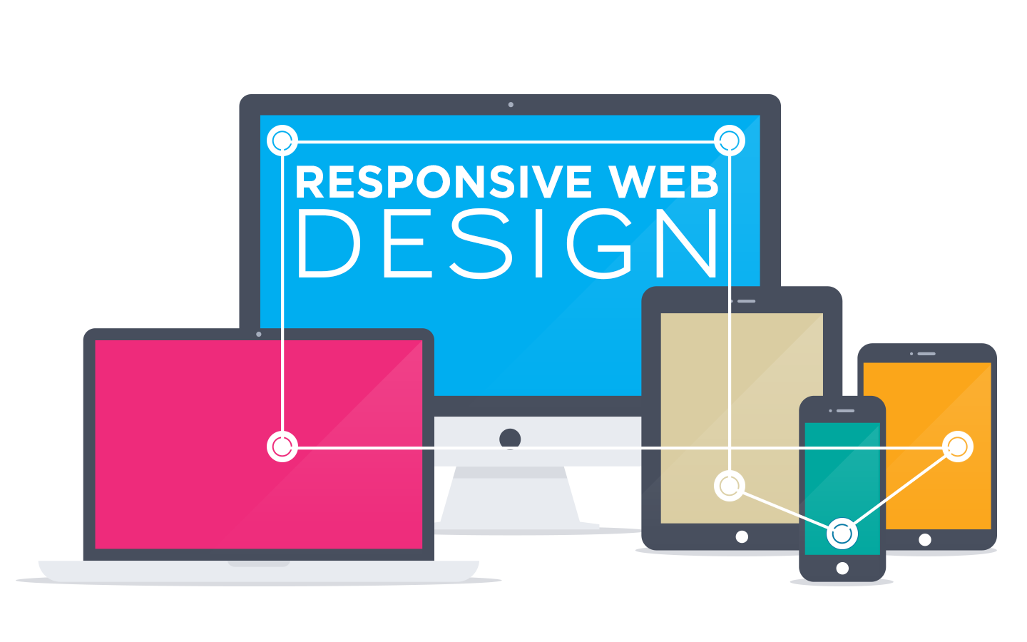
With the mobile time we live in, not only the homepage, but the entire website must be mobile-optimized and responsive. Mobile devices hold a great share in the traffic to your website. So, it is advised to make people who want to access your homepage from a mobile device enjoy their experience to the maximum.
4. It includes CTAs (calls-to-action)
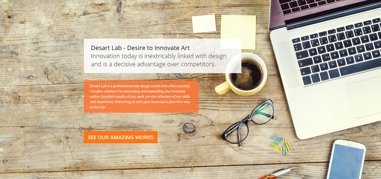
Calls-to-action are a great tool to acquire new leads and customers. They are used to guide the visitors through your website and to encourage them to perform certain actions.
It is also very important to give special attention to words and phrases used for your CTAs, depending on the outcome you want to reach.
5. It has great overall design
A well-deigned page and website in general, is the way to communicate your business value and help users make their way through the website, to get to the things they need.
For this, pay attention to the color combination, use of white space, content and CTA placement, fonts, visuals, and other elements of the web design.
Conclusion
Whether you have a website, or just consider building one, your homepage web design should be given priority. Focus on creating a homepage that will wow your visitors with great web design and performance from the first moment they arrive on your website. Thus, you make sure that the visitors will come back for more in the future.


