There is also the cultural factor that must be considered. Did you know that certain colors have opposed meaning in different countries? Let’s take white, for example. Although identifiable with purity and innocence in Western countries, white symbolizes death, sickness and unhappiness in China, India and Japan.
Color theory is a complex subject that can uncover significant details. It is also a critical element to learn prior to diving into a website design project, considering cultural and psychology meanings the colors convey. There is also the distinction by gender (there are colors that are preferred by women and disliked by men) that also has to be considered when creating a website for women or men only.
The infographic below shows the psychology of color and represents top world brands for separate color choice.
Source: Visualcontenting.com
As you can see from the information presented in the infographic, blue hues are widely used in website design.
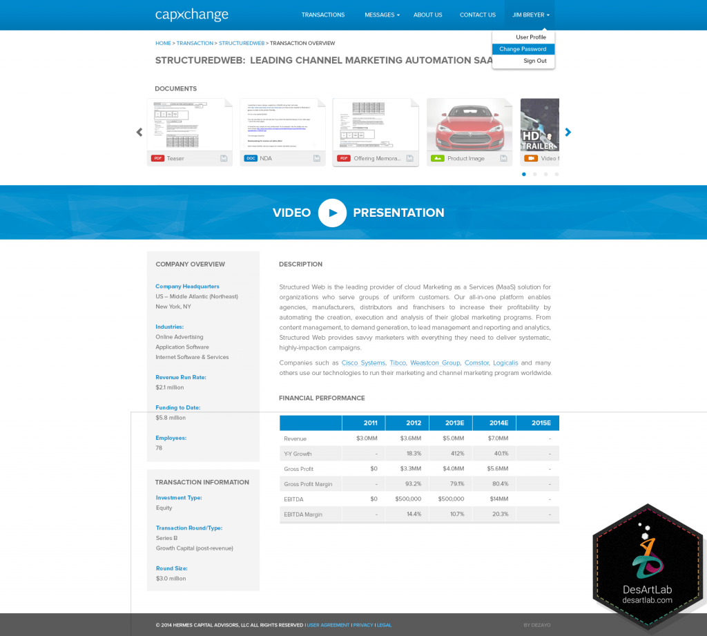
According to color psychology, blue is the color that inspires trust, honesty, loyalty, and authority (the darker the blue, the more authority it has). Blue hues have calming effect on people. Just think about the limitless blue of the sky or the mesmerizing ocean. Due to its psychological connotation, blue is favored for bank and financial websites design, accounting firms and other types of conservative companies, as it inspires trust and responsibility.
Blue is the color that DesArt Lab chooses to illustrate the Capxchange Investment GUI design – an investment monitoring control panel, emphasizing on the trust, loyalty and high responsibility of such type of business.
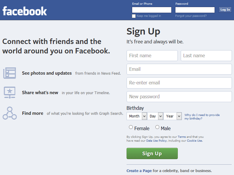
It is also used by companies who value customer service and who relate on transparency. It is no wonder that the world’s largest social network makes use of color blue on its homepage. Making transparency and trust its core values, Facebook relies on the feelings the blue color creates on its users.
Color tips to boost conversion
Identify the target audience
As it has already been mentioned above, color choice for website design depends on many factors, one of which being the gender factor. Women like certain colors, while men prefer others.
Source: Kissmetrics.com
Although one can think that women’s preferred color is pink, it is not the case. Even though pink suggests femininity in color psychology, it doesn’t mean that it is appealing to most women. You can have bigger conversion rates if you use blue, green or purple on women website.
Men also like blue and green, according to the survey. But surprisingly, brown is not in their top 3 preferred colors.
Choose the colors that translate the brand’s message
If you are a restaurant or a catering business, you will want to avoid using the color blue in the website design as it works as an appetite suppressant.
On the contrary, red and orange are colors that induce appetite. Red raises heart rate and thus makes people hungry. Orange increases mental activity and thus induces a sensation of hunger as well. These two colors are very powerful, joyful and juicy and when one feel such emotions it is more likely that eating will seem a good idea.
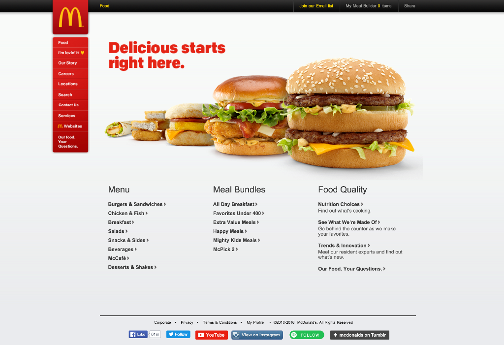
McDonald’s website is a good example of hunger-inducing color website design. Its use of red color is inviting and appealing to one’s tastebuds.
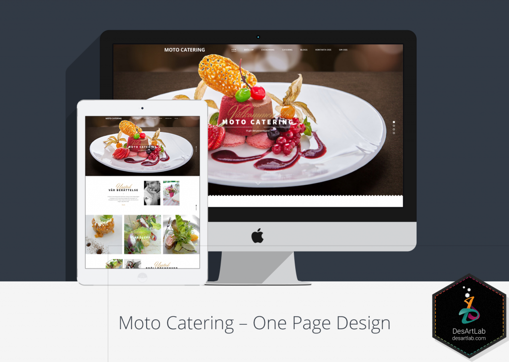
DesArt Lab also makes use of a red-predominant design for a catering one-page web design project, focusing on the connotation the color has with appetite.
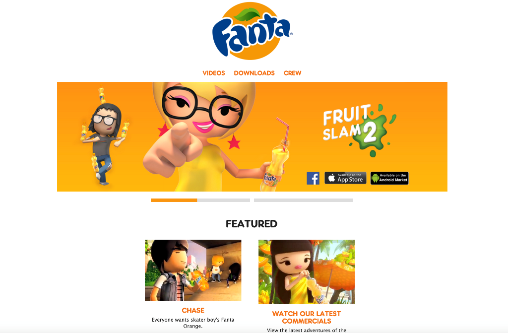
Fanta has also a very “orangey”, juicy, and tasty website.
Opt for one color to highlight
The use of multiple colors on a single website page can become overwhelming, especially when you want to highlight important sections of the web page, such as tabs, links, call-to-action buttons, headlines, search box, and etc.
In order to make the website design classy and smooth, use only one color for this purpose. You can choose any color that is more attention-grabbing; red, yellow or blue are good examples, although you can choose the one that best suits your brand personality.
Here is a good example of a website that makes use of a single color to emphasize on significant parts of its website, such as “Sign In” or “Start Now” call-to-action buttons, or it is used as background to emphasize the text that is designed to bring new leads:
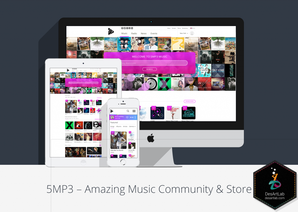
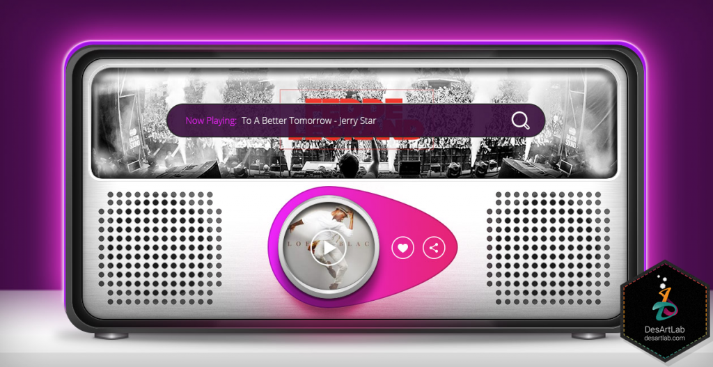
Similarly, DesArt Lab uses purple color to highlight the trendy-looking search box and play button for its 5MP3 music portal, focusing on the calming and uplifting spirit effect it has on people.
Use variations of the highlight color
Another important thing to consider when designing a website is to choose variations of your main website color to use for buttons, links, and other essential sections of the site. It is recommended to choose variations of the main site color to avoid confusion and to build a stronger and powerful brand image, sticking to the color that identifies with it.
Highlight color variations speak about the different ratings of the information and are used for hover effect.
Here is a good example of how highlight color variations can be used on a website:
Avoid using multiple colors
We’ve already said that multiple colors can become overwhelming and confusing. Plus, if you intend to use multiple colors in a single website you need to make sure that they harmonize among, and complement each other.
Therefore, make sure that you use a moderate number of colors on your website. Four to five colors, plus black and white, should be enough.
In brief about website colors
Colors play a significant role in website design and the message they send. It is important to rely on color psychology and theory to pick the hue that will translate to your brand’s value and mission. It might seem an easy task, but keep in mind that colors have different connotations, depending on the targeted geographical area and even gender audience.
There are a lot of surveys and case studies on this topic, so a more thorough research, before making any important decision, will bring you one step closer to your website success.


